
Ⓒ 2023 Kyligence, Inc. All rights reserved.

In today's data-driven world, AI-powered data analytics is gaining popularity as businesses seek to derive valuable insights from their vast amounts of data.
One area where AI is making significant advancements is in chart and graph creation. Traditionally, creating visualizations required manual effort and expertise in coding or design.
However, with the advent of AI, there are now various options available that can automate this process.
This blog post explores the possibility of using AI to create charts and graphs and discusses the different tools and technologies that enable this advancement.
By leveraging AI in chart and graph creation, businesses can enhance their data analysis capabilities and make more informed decisions based on visualized insights.
There are several AI-powered tools available that can assist in creating charts and graphs, making the process more efficient and user-friendly. Let's explore some of these tools:
The ChatGPT Code Interpreter plugin allows you to create graphs and charts by leveraging its data analysis and visualization capabilities.
To access the Code Interpreter plugin, you need a ChatGPT Plus subscription. Once you’ve upgraded to ChatGPT Plus, you can activate the plugin.
With the plugin enabled, you can upload files containing raw business data, such as CSV, Excel spreadsheets, or SQL databases.
By providing prompts related to data analysis and visualization, you can instruct ChatGPT to generate maps, charts, and other visual representations from the uploaded data.
By utilizing the Code Interpreter plugin, you can also work with math equations. ChatGPT can build Python code to solve math problems and provide accurate answers. Whether it’s solving simple text-based math questions or more complex qualitative math problems, ChatGPT can assist in finding solutions.
Keep in mind that while ChatGPT’s Code Interpreter plugin is powerful for data analysis, visualization, and math equations, it currently has limitations when it comes to analyzing visual data like images or PDFs with charts.
Excel Copilot, an AI-powered feature in Microsoft Excel, revolutionizes the process of creating graphs and charts by harnessing the power of large language models (LLMs) and your data in Microsoft Graph.
It allows you to effortlessly analyze trends, identify patterns, and generate visually stunning data visualizations in a matter of seconds.
By providing relevant content and suggestions based on your specific business context, Excel Copilot streamlines the entire data visualization process, saving you valuable time and effort.
Whether you’re a data analyst or a business professional, Excel Copilot empowers you to transform raw data into impactful graphs and charts with ease, enabling you to make informed decisions and communicate insights effectively.
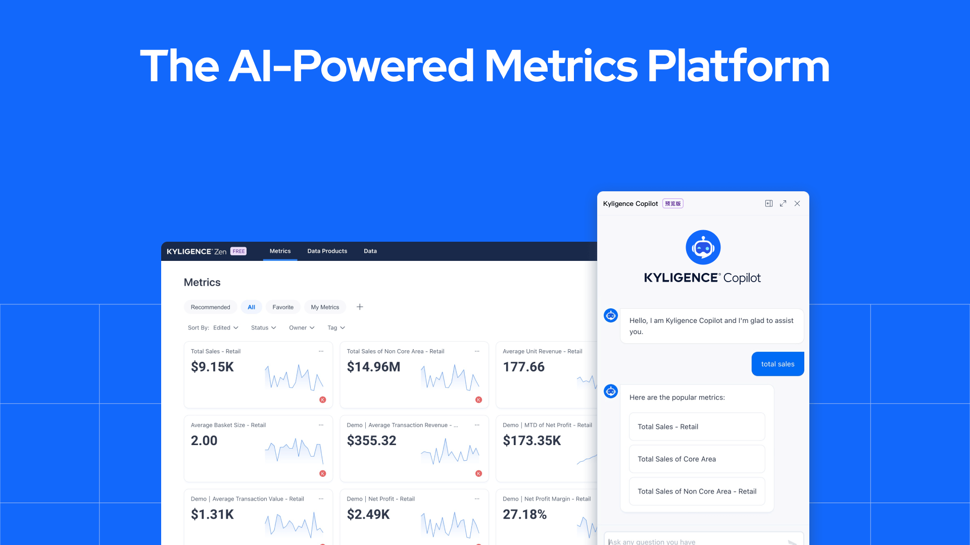
Kyligence Copilot is an AI-powered data analytics tool that includes chart and graph creation capabilities. It leverages natural language processing (NLP) and machine learning to understand user queries and generate visualizations accordingly.
With its conversational interface, users can interact with Kyligence Copilot using plain language commands, making it easy to create charts and graphs without needing to write complex code or scripts. This tool empowers users to explore their data visually, gaining valuable insights through a user-friendly interface.
These AI-powered chart and graph creation tools offer a range of benefits for data analysts, business professionals, and anyone looking to visualize their data effectively.
They simplify the process, save time, eliminate the need for extensive coding knowledge, and provide users with visually appealing and informative visualizations.
Using AI-powered chart and graph creation tools offers several benefits that enhance the data analysis process. Let's explore some of these advantages:
AI-powered chart and graph creation tools save time by automating the visualization process. Instead of spending hours manually creating visualizations, data analysts can rely on AI algorithms to generate them quickly and accurately.
This automation allows analysts to focus their time and effort on analyzing the data and deriving valuable insights. Additionally, these tools provide visualizations in real-time, enabling faster decision-making based on up-to-date information.
AI algorithms have the ability to generate visually appealing charts and graphs that are easy to interpret.
These algorithms take into account design principles and best practices to create professional-looking visualizations without requiring advanced design skills from users.
The improved quality of the visualizations enhances their effectiveness in conveying information, making it easier for stakeholders to understand and interpret the insights derived from the data.
AI algorithms have the ability to analyze large datasets and identify patterns and trends that may go unnoticed by human analysts. By leveraging AI in chart and graph creation, businesses can gain more accurate insights from their data.
These algorithms can uncover complex relationships between variables, detect outliers, and provide a deeper understanding of the underlying data. With more accurate visualizations, organizations can make better-informed decisions that lead to improved business outcomes.
AI-powered chart and graph creation tools make data analysis more accessible to a wider range of users.
They eliminate the need for extensive coding or design knowledge to create visualizations, empowering business professionals and non-technical users to explore and communicate data insights effectively.
With user-friendly interfaces and intuitive interactions, these tools enable individuals with varying levels of technical expertise to easily interact with their data, gain valuable insights, and make informed decisions.
Kyligence Zen and Kyligence Copilot are powerful tools that enable users to leverage AI in their data analysis workflows. Let's explore how these tools can enhance the data analytics process.
Kyligence Zen leverages AI to help users analyze and leverage business metrics effectively. With features like an AI-driven chatbot, unified metrics catalog, and automated metrics calculation, users can make informed decisions and save time in their data analytics process.
As mentioned earlier, Kyligence Copilot is a conversational AI interface that allows users to interact with their data using natural language queries. It eliminates the need for coding or scripting, making it accessible to all users. With Copilot, users can ask questions, request visualizations, and explore datasets intuitively.
By combining the capabilities of Kyligence Zen and Kyligence Copilot, users can streamline the analytics process, explore data interactively, and derive valuable insights with ease.
AI-powered chart and graph creation tools offer a range of benefits for data analysts and business professionals. These tools enhance the efficiency and accuracy of data analysis by automating the visualization process and providing real-time insights.
By leveraging AI tools like Kyligence Copilot, users can save time, gain valuable insights, and make data-driven decisions with ease.
So, don't wait! Try Kyligence free today!
Exploring AI Data Analytics: Advantages, Obstacles, and the Remedy
Distinguishing AI from Data Analytics: Understanding the Contrast
Transforming Data into Visual Art: ChatGPT's Graphical Abilities
Unveiling AI's Data Analytics Prowess: Trends and Solutions
Revolutionizing Business with Data and AI: A Glimpse into the Future